3 Week 2 Displaying Data Reading
Frequency Tables
Ungrouped Frequency Tables
Frequency tables are tables that organize and summarize quantitative data. The frequency tables in this class will consist of frequencies, relative frequencies, cumulative frequencies and cumulative percents. Being able to calculate each of these is important, but there will also be heavy emphasis on the contextual interpretation of each value.
45 working students were surveyed and asked what their hourly wage, in $, was. Their responses are summarized in the table below.
| Hourly Wage, in $ |
Frequency |
|---|---|
| 8.00 | 1 |
| 8.50 | 2 |
| 9.00 | 4 |
| 9.15 | 8 |
| 10.00 | 15 |
| 11.25 | 8 |
| 13.00 | 3 |
| 15.50 | 4 |
Frequency is a count of how many times a particular value appears in the data set. For the example, 1 student responded that they had an hourly wage of $8/hr, while 15 students said that they made $10/hr.
| Hourly Wage, in $ |
Frequency | Relative Frequency % |
|---|---|---|
| 8.00 | 1 | |
| 8.50 | 2 | |
| 9.00 | 4 | |
| 9.15 | 8 | |
| 10.00 | 15 | 33.3% |
| 11.25 | 8 | 17.8% |
| 13.00 | 3 | 6.7% |
| 15.50 | 4 | 8.9% |
Relative frequency is the proportion of the number of times a value appears in the data set out of the total number of values. In other words, take the frequency of each group and divide by the total sample size, then convert to a percentage. Often, the relative frequency values will need to be rounded, with one or two decimals being used. The total of the relative frequency values should total 100% (or if values were rounded, something very close to 100%). Interpreted in context, 2.2% of the students reported an hourly wage of $8/hr; 17.8% of students said their hourly wage was $11.25/hr.
| Hourly Wage, in $ |
Frequency | Relative Frequency % |
Cumulative Frequency |
|---|---|---|---|
| 8.00 | 1 | 1 | |
| 8.50 | 2 | 1+2=3 | |
| 9.00 | 4 | 3+4=7 | |
| 9.15 | 8 | 7+8=15 | |
| 10.00 | 15 | 33.3% | 15+15=30 |
| 11.25 | 8 | 17.8% | 38 |
| 13.00 | 3 | 6.7% | 41 |
| 15.50 | 4 | 8.9% | 45 |
The cumulative frequency is an accumulation, via addition, of the frequency values; in other words, it is the number of values in that group as well as in all of the previous/lower groups. The last cumulative frequency value should always be the sample size. An example of interpretation of these values: 38 students have an hourly wage of $11.25/hr or less.
| Hourly Wage, in $ |
Frequency | Relative Frequency % |
Cumulative Frequency |
Cumulative % |
|---|---|---|---|---|
| 8.00 | 1 | 1 | ||
| 8.50 | 2 | 1+2=3 | ||
| 9.00 | 4 | 3+4=7 | ||
| 9.15 | 8 | 7+8=15 | ||
| 10.00 | 15 | 33.3% | 15+15=30 | |
| 11.25 | 8 | 17.8% | 38 | 84.4% |
| 13.00 | 3 | 6.7% | 41 | 91.1% |
| 15.50 | 4 | 8.9% | 45 | 100% |
The last column of the table is the cumulative percent, which is an accumulation, via addition, of the relative frequencies. 15.6% of the students reported an hourly wage of $9.00/hr or less.
Grouped Frequency Tables
For many data sets, it will be necessary to group the values into intervals, or bins. When creating these grouped, binned, frequency tables, there are some rules that must be followed:
- All intervals must be of equal length; common lengths are convenient numbers like 0.5, 2, 5, 10 or multiples of 5 or 10.
- These intervals/bins must not overlap, so that each value falls within precisely one interval/bin.
On test day, an instructor keeps track of the finishing time, in minutes, for her 60 students. Where necessary, values in the table below were rounded to one decimal place.
| Time, in minutes |
Frequency | Relative Frequency % |
Cumulative Frequency |
Cumulative % |
|---|---|---|---|---|
| 0-9.99 | 2 | 3.3 | 2 | 3.3 |
| 10-19.99 | 5 | 8.3 | 7 | 11.7 |
| 20-29.99 | 8 | 13.3 | 15 | 25 |
| 30-39.99 | 22 | 36.7 | 37 | 61.7 |
| 40-49.99 | 16 | 26.7 | 53 | 88.3 |
| 50-59.99 | 6 | 10.0 | 59 | 98.3 |
| 60-60.99 | 1 | 1.7 | 60 | 100 |
In the table above, notice that the times, in minutes, are a range of values. Each interval length is 10 minutes, and based on how the intervals are written, there are no time values that would be counted in more than one of the intervals. The table says that 2 of the test finishing times fall between 0 and 9.99 minutes. 61.7% of the students finished their test in 39.99 minutes or less.
CRITICAL NOTE about interpretation: While the calculation of the statistics is important, it is critical that you understand the meaning of the statistic and how to interpret it. In the real world, most people will not be interested in how the value was calculated, but what it means within the context of a situation. You'll also want to avoid using technical vocabulary/terminology, because some people will not know those words.
For example, referring to the test finishing times table above, the cumulative frequency is 15 for the 20 to 29.99 interval. Ask yourself what the 15 stands for in a general sense; 15 what? Well, 15 of the test finishing times. What about them? 15 test finishing times were no more than 29.99 minutes. This would be a proper contextual interpretation of the value 15 from the table. Correct units are used for both the 15 and the 29.99; there is no mention of technical vocabulary; and this sentence explains what the value means in context, not how it was calculated.
Types of Graphs
There are many graphical ways to display data. This class will touch on pie charts, bar graphs, and line graphs, while focusing heavily on histograms and scatterplots. Not all graph types are appropriate for all types of data. Knowing the variable(s) that you wish to graph is KEY.
If you are interested in graphing just one qualitative variable, then you should consider using either a pie chart or a bar graph.
Qualitative Data
-
- For one variable, we can use either a pie chart or a bar graph to display our data.
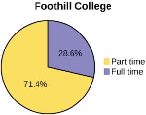
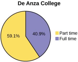
- In a pie chart, each category of our variable will represent a wedge (or piece) of the pie. The size of each wedge will correspond to the size of each category.
(Source: OpenStax, Introduction to Statistics, Figure 1.4)
The pie chart examples above show the percentage of students who identify as full time vs part time at two different colleges.
-
-
- Pie Charts are great to use if the sum of all the categories add up 100%.
-
-
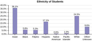
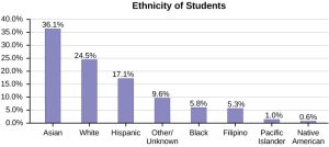
- In a bar graph, the height (or length) of the bars corresponds to the number or percent in the category.
- In a bar graph, the height (or length) of the bars corresponds to the number or percent in the category.
(Source: OpenStax, Introduction to Statistics, Figure 1.8)
-
- We may find that it is easier to read a bar chart if we organize the categories by height of the bars from largest to smallest. If we do this, we have a Pareto Chart.
-
- When is it more appropriate to use one or the other (pie vs bar)?
- Suppose in a survey, a person can be counted in two categories. In this case, the sum of the percentages is greater than 100%, so a pie chart cannot be used.
- In addition if the sum of the percentages is less than 100%, then a pie chart should not be used.
- When is it more appropriate to use one or the other (pie vs bar)?
Quantitative Data
We have many more options when it comes to displaying quantitative data. The type of graphs that are available depend how many variables that we have.
-
- If we have one quantitative variable, we will use a histogram. This will be one of the most common graphs that we will be using in this class.
- In a histogram, the data values of the variable we are studying will be on the horizontal (or x-axis). On the vertical axis (or y-axis) will be the frequency.
- Note that in a histogram, the bars are adjoining.
- If we have one quantitative variable, we will use a histogram. This will be one of the most common graphs that we will be using in this class.
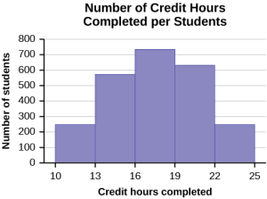
We will usually use technology/apps/whatever to produce our graphs, however, it is always good to have an idea of how to create the graph that you need. Since histograms will be particularly important in this class, watch Khan Academy Creating a Histogram by Hand video [7:21] to learn how to manually produce a histogram.
Khan Academy Interpreting Histograms video [4:28] will give you an idea of what you are looking at when you see a histogram.
-
- Another option to display data for one quantitative variable is by using a frequency polygon. Like the histogram, the horizontal axis (x-axis) represents the data values of the variable we are studying, and the vertical axis (y-axis) represents the frequency of the data value. The frequency points are connected by using a line segment.
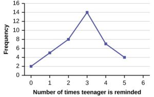
(Source: OpenStax, Introduction to Statistics, Figure 2.2)
-
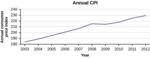
- We can also use a time series graph when we are looking at large data sets of one variable over time.
- In a time series graph, the horizontal axis represents the date or time increments, and the vertical axis represents the value of the variable that we are studying.
- In a time series graph, the horizontal axis represents the date or time increments, and the vertical axis represents the value of the variable that we are studying.
- We can also use a time series graph when we are looking at large data sets of one variable over time.
(Source: OpenStax, Introduction to Statistics, Figure 2.10)
-
- If we happen to have two quantitative variables, then the appropriate way to display this data is by using a scatterplot.
- In a scatterplot, the horizontal (x-axis) represents one quantitative variable and vertical variable (y-axis) represents a second quantitative variable.
- Scatterplots are useful to display data, since they allow trends between two quantitative variables to be seen quite easily.
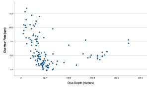
- If we happen to have two quantitative variables, then the appropriate way to display this data is by using a scatterplot.
(Source: Created on SPSS, using Data from DASL--https://dasl.datadescription.com)
Misleading Graphs
Graphs are a nice, visual way to display data, but you need to be careful when considering the data that they represent. Whether accidental or on purpose, we can easily be misled into thinking that the graph says one thing, when really, something else is true. A very common misleading aspect of a graph is when the scale on the vertical axis does not start at 0.
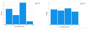
(Source: Created on SPSS, using Data from DASL--https://dasl.datadescription.com)
As you can see, the graph on the left shows a range on the vertical axis that is only 12 to 15 which suggests a very large difference between bars. When you 'zoom out' and include 0 on the vertical axis, seen on the right, you notice that the BIG difference in value previously seen, is almost non-existent. The vertical axis not starting at 0 is a misleading graph aspect, because if you are not paying attention to those vertical values, you may think that the difference between the groups is much bigger than it really is.
Here is a great video that looks at misleading line graphs: Khan Academy on Misleading Line Graphs video [4:52].
These are by no means the only misleading graph aspects out there; other misleading aspects will be discussed in class.
Student Course Learning Objectives
2. Describe data both graphically and numerically
a. Create and interpret frequency tables and distributions
b. Create and interpret various graphs (e.g., bar, pie, histogram, boxplot, scatterplot, line)
c. Describe the shape of a graph (e.g., skewed, normal, bimodal)
d. Recognize misleading graphs
Attributions
Adapted from "Week 2 Displaying Data Reading" by Sherri Spriggs and Sandi Dang is licensed under CC BY-NC-SA 4.0.
