4 Week 3 Central Tendency & Variability Reading
Characteristics of Distributions
Measure of Central Tendency
First, a Khan Academy video: An Introduction to Measures of Central Tendency [8:53].
Discussing central tendency means that we want to describe the center of the (quantitative) data set of interest. Mean and median are the most common measures of center, and for this class, we will also look at mode as a third possible center measure. With each of these measures of center, we will not be spending time doing the calculations by hand, as we have technology to do it for us (in this class, SPSS). The goal in this class will be to learn how to interpret each measure in the context of the situation, as well as to determine which measure is the best center measure for a particular distribution of values. This determination of best center is based on the shape and characteristics of the distribution.
Mean is probably the term that you are most familiar with, as it is the arithmetic average of your data values. Mean is calculated by adding up all of the data values, then dividing by the total number of values.
Another frequently used measure of center is the median, defined as literally the center value of all of the data after all values has been ordered, smallest to largest. The median is also the 50th percentile, and is interpreted as such.
The mode is the most frequently occurring value within the data set. If no values repeat within the data set, that data set does not have a mode. It is also possible to have multiple modes if there are several values that repeat the same number of times. There is no limit to the number of modes that a data set might have.
As mentioned earlier, you will be asked to interpret each of these measures of center in the context of the given situation. When asked to interpret values in context, you are not being asked to explain how to calculate the value. Consider what the general, Non-Statistics person would be interested in. They are not really interested in how the value was found, but rather what it represents within in the context of a situation.
Example: Thinking back to the diving Emperor penguins, a scientist collects the dive duration, in minutes, for 125 penguins. Her research found the following statistics:
| Mean | 7.31 |
|---|---|
| Median | 8.10 |
| Mode | 1.05 |
Based on the given context,
Mean: The average dive duration for an Emperor penguin is 7.31 minutes.
Median: 50% of the Emperor dive durations lasted 8.10 minutes or less. (It would be alright to say 'or more', since the median is the 50th percentile.)
Mode: The most common Emperor dive duration was 1.05 minutes.
Notice how in all three interpretations the statistical value is stated (7.31, 8.10, 1.05), units are mentioned (minutes), and there is a reference to the overall context (Emperor penguin dive durations). Also, notice how none of the interpretations use the vocabulary word (mean, median, mode) in the contextual sentence.
Measures of Variability/Spread
There are three measures of variability that we will be looking at. Range is the most basic measure of the three, and found by taking the maximum value of the data set and subtracting the minimum value. This difference is the span of values for the data set.
Interquartile Range (IQR) is the measure of variability that most students are least familiar with. It is literally the range of the inner quartile of the data set, which is the span of the middle 50% of the data.
If you needed to calculate the IQR by hand, the Khan Academy Calculating IQR video [6:11] shows you how. This process is not too tricky with a small data set, but can be quite tedious with larger data sets, so in our class we will use SPSS to help us.
It is important to note that SPSS will be used to calculate the 25th percentile as well as the 75th percentile, however, students will have to subtract the two in order to find the IQR, because SPSS does not do this calculation. To do this calculation: 75th percentile - 25th percentile = IQR, or Q3 - Q1=IQR.
Standard deviation is a very important measure as it represents the average distance a particular data value is from the mean of the data set. Standard deviation, as well as mean, will be discussed extensively when we work with Normal curves.
While we will let SPSS calculate the standard deviation for our data sets, here is the formula:
[latex]\sigma=\sqrt{\frac{\sum{(X-\mu)^2}}{N}}[/latex],
where [latex]X[/latex] is each data value, [latex]\mu[/latex] is the mean, and [latex]N[/latex] is the number of data values.
This formula assumes that the data that you are working with is the population. If you wish to find the standard deviation of a sample, then adjust the [latex]\mu[/latex] to be [latex]\bar{X}[/latex], and change the denominator to [latex]N-1[/latex].
To see how you would calculate standard deviation with this formula, check out either How to Calculate the Standard Deviation YouTube video [3:54] or visit Khan Academy Calculation Standard Deviation Step by Step (article).
NOTE: You will not need to perform this calculation in class, but it helps with understanding standard deviation in context to see how the formula works.
Example: Thinking back to the diving Emperor penguins, a scientist collects the dive duration, in minutes, for 125 penguins. Her research found the following statistics:
| Standard Deviation | 4.07 |
|---|---|
| Interquartile Range | 7.42 |
| Range | 17.10 |
Based on the given context,
Standard Deviation: On average, each Emperor penguin's dive duration varies 4.07 minutes from the mean.
Interquartile Range: The middle 50% of Emperor penguin dive durations span 7.42 minutes.
Range: The overall span of the Emperor penguin dive durations is 17.10 minutes.
Notice how in all three interpretations the statistical value is stated (4.07, 7.42, 17.10), units are mentioned (minutes), and there is a reference to the overall context (Emperor penguin dive durations). Also, notice how none of the interpretations use the vocabulary word (standard deviation, interquartile range, range) in the contextual sentence.
Shapes of Distributions
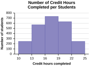
Histograms can take on many shapes, which can, in turn, tell you a lot about the data set and statistics of the data set. Most students have heard of the 'bell curve', which is a symmetric curve known as a Normal curve in Statistics.
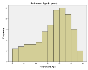
Skewed data comes in two forms, left skewed and right skewed. Left, or negative, skewed data has the majority of the data on the high side of the histogram, with fewer and fewer values on the small side. This forms a 'tail' on the left side of the graph.
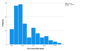
The opposite of this is right, or positive, skewed data. The majority of data is on the small side in this case, with fewer and fewer values on the high side. The 'tail' is formed on the right.
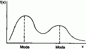
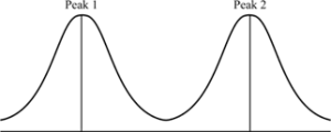
Bimodal histograms are histograms that have two clear peaks, ie modes. These peaks do not have to be identical in height, as seen in the left-hand graph.
A multimodal histogram has 3 or more clear peaks. Like bimodal, these peaks do not have to be exactly the same height.
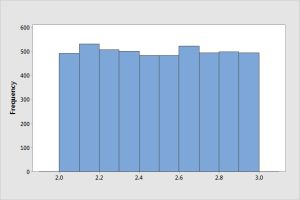
In a uniform, or flat, distribution the bars are roughly the same height. They do not have to be identical in height in order to be considered a uniform distribution.
If you'd like to see more about distribution shapes, view Khan Academy on Shapes of Distributions video [5:06] (you can stop watching at 3:18) or also Histograms - Shape of Data YouTube video [7:54].
Student Course Learning Objectives
2. Describe data both graphically and numerically
b. Create and interpret various graphs (e.g., bar, pie, histogram, boxplot, scatterplot, line)
c. Describe the shape of a graph (e.g., skewed, normal, bimodal)
e. Calculate mean, median, mode
f. Calculate range, interquartile range, variance and standard deviation
g. Use descriptive statistics to describe data
6. Communicate in writing the results of statistical analyses of data
Attributions
Adapted from "Week 3 Central Tendency & Variability Reading" by Sherri Spriggs and Sandi Dang is licensed under CC BY-NC-SA 4.0.
